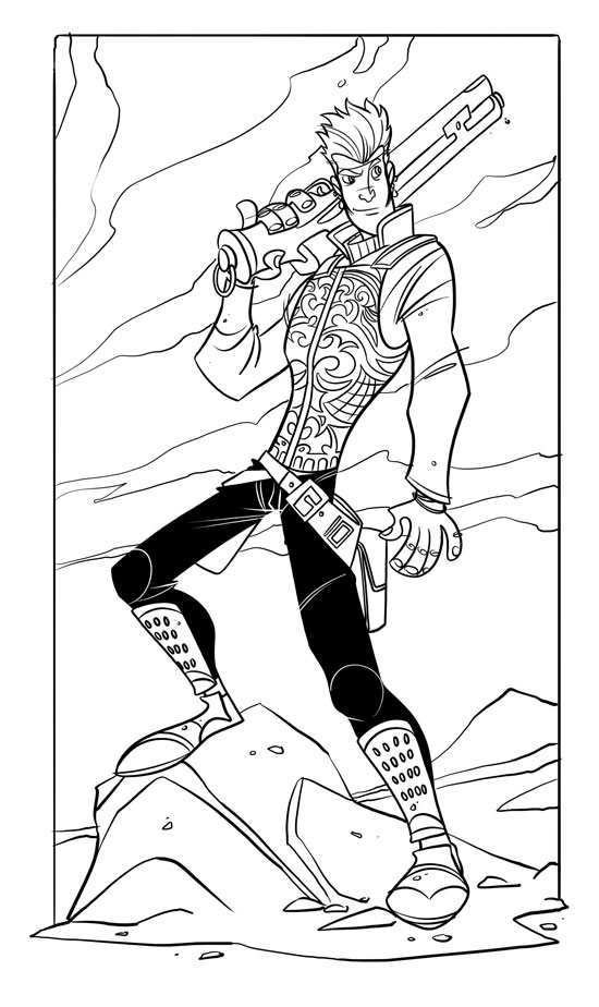
I Had to ink my Balthier sketch from yesterday. I tried to fix some of the problems like the giant hands and stuff.
25 comments:
Anonymous
said...
First comment yea incredible that details on the face and minor stuff (leg armor) where added n the ink part, I`ve seen a lot of ink works that don do justice to the pencils.
Anyway just a simple lines makes a incredible background (less is more)
Glad that you shared your work so that all your fans can see the whole process.
Speaking of "the whole process", I'd like to see what goes into coloring these drawings (when you get around to it). I've always had a bit of a tough time coloring in an app like Photoshop or or Paint Shop Pro.
Great work on Balthier, Gabe, the pose, espression and detail are fantastic--I love the style. I agree wholeheartedly with your opinion of Final Fantasy XII, and I look forward to playing more. Balthier is great. Keep up the nice work, man, it's worth the wait.
It definately got even better. I think the left arm/hand was greatly improved and must disagree with Mr. Nielson about the effectiveness of it. It adds a relaxed air to the character. The facial and armor details are equisite. I must admit though, I still find the right hand overly large, especially now that it is not in proportion to the left. Still, a great job though.
Yea this is good and all, but it just doesn't seem like the Balthier I know. This guy is a little too cocky in his expression, Balthier is more humble I think
Excellent work, nicely combining the "epic" Square style with your own; something that does strike me as off is not his hands or arms, it's his right leg. It's too perfectly... skinny? [if that's the right word]. His left leg has some excellent muscle hinting, but his right leg looks too... off. Perhaps just a slight bit on the outside of the thigh, or just a hit on the inside, depending on how you have his muscles flexing.
You know, when I cracked open my Collector's Edition guide to see Balthier as my randomly selected cover, I originally wondered who this asshat was exactly, having read nothing prior to purchasing the game. However now that I've come to 'know' the character, I understand the drawing power he seems to have on most people, and I'm quite glad.
This is a wonderful image of him. The expression gives the slightest hint at the cleverly phrased jab he's about to dispense. The armor/vest is beautiful, and I particularly like the way the hair and shirt came out in the finished product. Might we see a colored version of this at some point?
With a great job like that on Baltier, I'd really like to see Ashe and Fran drawn by you now! The pose and the expression are perfect for Balthier, even the gun looks perfectly like his starter!
That is so *awesome*, Gabe. You did an excellent job capturing the character. Balthier is my favorite so far in the game, so it's nice to see you do him justice in art. Rock on!
Wow, great job! ...I have given recommendation that you should paint that lovely piece of art. Keep up the great work, and never hesitate to post more concept art! The rough stuff is the best. :D One more thing - PLEASE do Fran! She's my fave. ^_^
Agreed, do Fran. Just make sure you capture her personality as a serious minded, taciturn, somewhat wistful warrior. Don't make the mistake of casting her as a sultry seductress just because she happens to wear lingerie to battle.
Fran is my favourite character, but I kind of think they covered up the wrong set of cheeks on her. Oh well...
*grrrr* Your fan art makes my fan art look like arse...however I am but starting out as an artist and am getting more adept by the day, and this blog helps out quite a lot, cheers for doing it.
I really miss the expression on his face from the sketch. I thought it was much more appropriate and just plain old better. But, with the exception of that the piece is fantastic.
Like a lot of people Balthier is by far my favorite. I refuse to play with anyone else in my party except for Vaan, Balthier, and Fran.
And speaking of Fran, you've got to capture that magical ass. I'm not even an ass man and I can't help but be smitten by it!
Hi Gabe! I thought this was an amazing drawing and I spent this morning working on coloring it. You can see that here: http://www.deviantart.com/deviation/43813649/
If you want, I can take it down. I understand that you're probably working on a colored version of this already. I just wanted to have some fun (out of the snow) and this seemed like a great way to pass some time and practice using my Wacom.

25 comments:
First comment yea
incredible that details on the face and minor stuff (leg armor) where added n the ink part, I`ve seen a lot of ink works that don do justice to the pencils.
Anyway just a simple lines makes a incredible background (less is more)
Glad that you shared your work so that all your fans can see the whole process.
Speaking of "the whole process", I'd like to see what goes into coloring these drawings (when you get around to it). I've always had a bit of a tough time coloring in an app like Photoshop or or Paint Shop Pro.
Nice lines! Posing of the left arm (hanging one) seems a bit limp and uninteresting. Doesn't compliment the post very well. But I like the rest of it.
Edit: POSE, I meant. Not post.
Hell yeah, now it looks even better! I love how your linearts!
Great work on Balthier, Gabe, the pose, espression and detail are fantastic--I love the style. I agree wholeheartedly with your opinion of Final Fantasy XII, and I look forward to playing more. Balthier is great. Keep up the nice work, man, it's worth the wait.
looking good. you did a nice job with the fix gabe.
-Gavin
Ah man, and I thought the sketchy eyebrows rocked!
Change 'em back! ;O
Please continue being awesome and keep uploading art! :)
It definately got even better. I think the left arm/hand was greatly improved and must disagree with Mr. Nielson about the effectiveness of it. It adds a relaxed air to the character. The facial and armor details are equisite. I must admit though, I still find the right hand overly large, especially now that it is not in proportion to the left. Still, a great job though.
Fixing the gigantic hand greatly improved this drawing; although his right hand is still way too big.
Yea this is good and all, but it just doesn't seem like the Balthier I know. This guy is a little too cocky in his expression, Balthier is more humble I think
Excellent work, nicely combining the "epic" Square style with your own; something that does strike me as off is not his hands or arms, it's his right leg. It's too perfectly... skinny? [if that's the right word]. His left leg has some excellent muscle hinting, but his right leg looks too... off. Perhaps just a slight bit on the outside of the thigh, or just a hit on the inside, depending on how you have his muscles flexing.
You know, when I cracked open my Collector's Edition guide to see Balthier as my randomly selected cover, I originally wondered who this asshat was exactly, having read nothing prior to purchasing the game. However now that I've come to 'know' the character, I understand the drawing power he seems to have on most people, and I'm quite glad.
This is a wonderful image of him. The expression gives the slightest hint at the cleverly phrased jab he's about to dispense. The armor/vest is beautiful, and I particularly like the way the hair and shirt came out in the finished product. Might we see a colored version of this at some point?
-Kevin
With a great job like that on Baltier, I'd really like to see Ashe and Fran drawn by you now! The pose and the expression are perfect for Balthier, even the gun looks perfectly like his starter!
That is so *awesome*, Gabe. You did an excellent job capturing the character. Balthier is my favorite so far in the game, so it's nice to see you do him justice in art. Rock on!
Wow, great job!
...I have given recommendation that you should paint that lovely piece of art.
Keep up the great work, and never hesitate to post more concept art! The rough stuff is the best. :D
One more thing - PLEASE do Fran! She's my fave. ^_^
Agreed, do Fran. Just make sure you capture her personality as a serious minded, taciturn, somewhat wistful warrior. Don't make the mistake of casting her as a sultry seductress just because she happens to wear lingerie to battle.
Fran is my favourite character, but I kind of think they covered up the wrong set of cheeks on her. Oh well...
This is looking really good, you should do some other FFXII sketches as well!
*grrrr* Your fan art makes my fan art look like arse...however I am but starting out as an artist and am getting more adept by the day, and this blog helps out quite a lot, cheers for doing it.
GREAT work. I'd love to see more FFXII fanart from you. I'll second the other guy's request for Fran.
Nice art!
I'd love to see your interpretation of Basch though.
I really miss the expression on his face from the sketch. I thought it was much more appropriate and just plain old better. But, with the exception of that the piece is fantastic.
Like a lot of people Balthier is by far my favorite. I refuse to play with anyone else in my party except for Vaan, Balthier, and Fran.
And speaking of Fran, you've got to capture that magical ass. I'm not even an ass man and I can't help but be smitten by it!
baltheir seems a bit shorter to me. Something not as lanky, you know?
I've always admired your art- and I'm really digging the inkwork and expression you put into this one. Frickin' awesome <3
Hi Gabe! I thought this was an amazing drawing and I spent this morning working on coloring it. You can see that here: http://www.deviantart.com/deviation/43813649/
If you want, I can take it down. I understand that you're probably working on a colored version of this already. I just wanted to have some fun (out of the snow) and this seemed like a great way to pass some time and practice using my Wacom.
Excellent art, as always!
Post a Comment