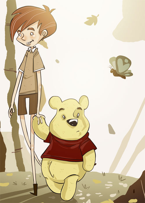
This is part of a piece I did for a friend’s nursery. They have a new baby on the way and I wanted to do something cool they could put up in his room. I was going for a sort of Tim Burton meets Winnie the Pooh style.
It looks cool for like, us... Pooh is getting ready to pounce on something ^^; And Christopher Robin just spotted something interesting o.o Good job though =)
I like it..I don't think it's creepy. It reminds me more of a retro feel from the seventies...linear..abstract. Remember the backgrounds in the Bugs Bunny cartoons? For more of a Tim Burton feel give Pooh a leather shirt with dirty metallic accents and make Christopher Robin a whitish pale! :-)
I think it's very cute. Pooh does seem to be distracted. I suspect he's either thinking about honey, or thinking where he might be able to ditch Christopher Robin in order to pursue honey.
Wish I could comment on the technical aspects, 'Christopher Robin' does seem a tad Burton-esque in the lankiness but otherwise I don't see the creep factor of Burton in it. It's just awesome, well done. It makes me want to sire a youngling just to have something like this within thier close confines.
A nice surrealistic turn I'd say. Curious George once freaked me out as a kid, and I'm a better freak for it. I think the benefactors of this will enjoy. Nay, must enjoy!
Pooh's right leg confuses me a little although I guess the old story illustations and Disney drawing also made his legs look a weird combination of pudgy and spindly.
Just wow. Your work continues to amaze me. I'd really love to see the twist you might give to the other characters from the 100 Acre Wood using this as a starting point.
I can't remember if you really were going to do a childrens' book or if my brain fabricated that, but this pic proves that you really should.
I have one of the limited "Tea with the Moon" prints of Catsby and Twisp, and would love to see something like that, but this pic shows that you could do a great childrens' book with a style all your own -- though I understand you probably couldn't do a Pooh book.
Love it, and thanks for sharing this kind of thing with us!
I found you through the "Blogs of note", and am absolutely devastated by this picture. Will definitely look in your archives for more.
It's not scary, just a bit more ..unsettling.. than the usual babylike look. The empty eyes are of course those of the great Capitain Haddock by Herge. A sign of insanity about to break out? That's the "unsettling" thing I guess.
I just straight up love this. Sure, it's a little weird, but if your friends wanted a standard Christopher Robin and Pooh, they wouldn't have asked you to do it, right? Love it. Makes me happy that I came across it.
Wow, and wow again. Magnificent! Definitely Tim Burton-ish, but not too much. Especially color-wise. Very nice, warm colors. Reminds me of time spent in autumn. I'm going to get some pumpkin pie and meander over to the nearest harvest festival.
Awesome work - I can see the Burtonesque in there (particularly he limbs) although it struck me as very much how Neil Gaiman might approach the Pooh-verse.
I would certainly add my voice to the wallpaper request. You know, if you have time between drawing and superhero stuff. ;)
Fantastic Palette!!! I ache for the ability to compose a palette like that. How do you do it???
IMHO the characters are very Don Bluth in facial characteristics and shading, & Burtonesque in elongation, palette and Pupil-less eyes. This piece is very Awesome and Inspiring. THANKS!
Nice picture, but Pooh bear doesn't wear clothes. Except in Disney. Look at all the E.H. Shepherd illustrations in the orignal book. Bah, I hate the Disney'isation of poor old Pooh! Having said that, do you want to do one for my kids nursery :)

74 comments:
Neat. The Christopher Robin is a just a shade over under creepy.
I think your use of colors are what really gives it the Tim Burton-ish feel. Well done.
Aren't you afraid that'll scare tiny chitluns?
Tim Burton style is a bit creepy.
It looks cool for like, us...
Pooh is getting ready to pounce on something ^^; And Christopher Robin just spotted something interesting o.o
Good job though =)
I love the subtle stuff, like Pooh's texture and Christopher Robin's cheeks and knees.
Excellent use of color.
Definately a bit of the creepyness.
Leave it in by all means, but if you decide to do any alterations I think creep-factor could be toned down by giving them pupils in their eyes.
Yeah, a pupil-less pooh could scare a young child, but I don't think a baby would be scared.
It's awesome... adults might think it's creepy but I doubt kids will. They tend to see things differently.
d'awwwwwwwwwwwwwwwwwwwww.
the lankyness of christopher robin screams burton, well done burton.
pooh's belly makes me hmmm, but damn i want this in my room. XD
Why do they remind me of zombies?
I'm glad you didn't do Tigger... the poor kid would never sleep! :)
Impressive deviation from your usual style! Your use of shapes still reveal it as yours, but the linework is so different. Great job.
I like it..I don't think it's creepy. It reminds me more of a retro feel from the seventies...linear..abstract. Remember the backgrounds in the Bugs Bunny cartoons? For more of a Tim Burton feel give Pooh a leather shirt with dirty metallic accents and make Christopher Robin a whitish pale! :-)
I think it's very cute. Pooh does seem to be distracted. I suspect he's either thinking about honey, or thinking where he might be able to ditch Christopher Robin in order to pursue honey.
I think if Tim Burton ever actually met Winnie the Pooh, the universe would collapse in on itself.
that is fucking awesome.
Wish I could comment on the technical aspects, 'Christopher Robin' does seem a tad Burton-esque in the lankiness but otherwise I don't see the creep factor of Burton in it. It's just awesome, well done. It makes me want to sire a youngling just to have something like this within thier close confines.
that's awesome, keep em coming.
A nice surrealistic turn I'd say. Curious George once freaked me out as a kid, and I'm a better freak for it. I think the benefactors of this will enjoy. Nay, must enjoy!
I fully enjoy this piece.
Very unique.
Butterfly and leaves are nice touch.
It is kinda eerie with the clear eyes and all... the chris. robbin blush seems out of place tho... seems strange.
-- MrMacMan
Very nice. Certainly the coolest Winnie the Pooh drawing I've ever seen.
Not that I've seen many Winnie the Pooh drawings, but whatever.
fantastic style! great to see something different from you once in a while.
That is awesome. I love the Burton-ish feel, much more interesting than the traditional Pooh look.
Pooh's right leg confuses me a little although I guess the old story illustations and Disney drawing also made his legs look a weird combination of pudgy and spindly.
this is pretty cool. its not like the rest of the stuff here(the warriors and gabeurai stuff).
Just wow. Your work continues to amaze me. I'd really love to see the twist you might give to the other characters from the 100 Acre Wood using this as a starting point.
My three-year-old took one look at my computer when I was reading the post and freaked out. In a good way. This is wonderful.
They look like a lesbian couple where Pooh is the butch. I love it :)
"Tim Burton meets Winnie the Pooh style."
cool combinations anyway!:) keep up your good work! really cool!
Creepy.
A really nice look to this piccy !
I can't remember if you really were going to do a childrens' book or if my brain fabricated that, but this pic proves that you really should.
I have one of the limited "Tea with the Moon" prints of Catsby and Twisp, and would love to see something like that, but this pic shows that you could do a great childrens' book with a style all your own -- though I understand you probably couldn't do a Pooh book.
Love it, and thanks for sharing this kind of thing with us!
: )
I like it. Where were you when I wanted a poster of Winnie the Pooh . . . many, many years ago.
Yay gabe!
Whoa, really cool style.
I like this!
OH - my - god!
I found you through the "Blogs of note", and am absolutely devastated by this picture. Will definitely look in your archives for more.
It's not scary, just a bit more ..unsettling.. than the usual babylike look. The empty eyes are of course those of the great Capitain Haddock by Herge. A sign of insanity about to break out? That's the "unsettling" thing I guess.
Thanks for sharing.
/Genilimaa
Hi there:
Just passing by yur page..very interesting stuff. Do keep up the good work
Meghna
Hi;
just passing by yur page. Veryu interesting stuff..do keep up the good work
Meghna
Too nice!
wow!
Too nice! wow!
hey this ones is really cool !! congrats on makin it to the Blogs Of Note !!
I think Tim Burton style is amazing and well, the deep dark woods are part of almost every fairy tale...great imagry!
I just straight up love this. Sure, it's a little weird, but if your friends wanted a standard Christopher Robin and Pooh, they wouldn't have asked you to do it, right? Love it. Makes me happy that I came across it.
Wow, and wow again. Magnificent! Definitely Tim Burton-ish, but not too much. Especially color-wise. Very nice, warm colors. Reminds me of time spent in autumn. I'm going to get some pumpkin pie and meander over to the nearest harvest festival.
Awesome work - I can see the Burtonesque in there (particularly he limbs) although it struck me as very much how Neil Gaiman might approach the Pooh-verse.
I would certainly add my voice to the wallpaper request. You know, if you have time between drawing and superhero stuff. ;)
That is exactly what I though when I saw it...Nice Work!
I love this - do you do commissions?
I just love the idea of TIm Burton meets Winnie the Pooh. And very well executed too. Wonder how Maralyn Manson meets the care bears might look.
Diccon
Invest in property affordably.
Nor-T-Shirts
Get two free links for your site.
My Blog
Ah! Can you make a wallpaper of it?
That'd be wicked.
or Clay Aiken meets Winnie the Poo.
This is amazing!!! Your lucky friends baby - I have a six month old son and stuff like this on his walls would ROCK!
Very Nice!
I'd actually watch a Winnie the Pooh cartoon or movie if it was done in that style.
Well done.
Fantastic Palette!!!
I ache for the ability to compose a palette like that. How do you do it???
IMHO the characters are very Don Bluth in facial characteristics and shading, & Burtonesque in elongation, palette and Pupil-less eyes. This piece is very Awesome and Inspiring. THANKS!
Great job - I like the use of this in a nursery...it's not a juvenile depiction, which is so overused for kids, but a nice edgy touch.
i wish i was your friend's kid. jeez.
It's a good thing you mentioned the "Tim Burton" thing because I was going to say this has mildly-creepy undertones to it. Especially the hollow eyes.
I can't help but think of Se-pooh-roth.
Nice picture, but Pooh bear doesn't wear clothes. Except in Disney. Look at all the E.H. Shepherd illustrations in the orignal book. Bah, I hate the Disney'isation of poor old Pooh! Having said that, do you want to do one for my kids nursery :)
tim said: "I can't remember if you really were going to do a childrens' book or if my brain fabricated that..."
The Last Christmas?
why do you all know his name is Christopher Robin , are you all pooh fans?
you are all so lame
oh and btw great drawing
Awesome stuff.
I wish my parents had a friend like you when I was born
bNz1d3 Your blog is great. Articles is interesting!
bCp3ZI Thanks to author.
Jy3tyy Good job!
9iucHx Nice Article.
Nice Article.
Please write anything else!
Magnific!
Wonderful blog.
Thanks to author.
TRCG9F Good job!
Magnific!
Post a Comment